Guest Blogger Meara Waxman ’19
Color scheme, organization of text, and images: all of these aspects are important to consider when creating a rhetorically effective poster and presentation. As I milled around the different posters lining the Great Hall and Elon’s SURF Day (Student Undergraduate Research Forum), I started to notice that the most complicated posters did not always turn out to be the most rhetorically effective.
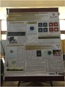
 First, I saw that the scientific presenters often filled their entire poster with words and complicated graphs. As shown in the image to the right, it was difficult to pull out the most important information. Even as my eyes were naturally drawn to the images in the top right-hand corner, I could not immediately tell what the image was supposed to depict. The issue was not that the information was too technical, just that there was too much information on the page. Since the presenter was also speaking about the topic, I felt that this poster, while informative, could have been more effective if it had used the text to highlight the main points instead of summarizing all of the research.
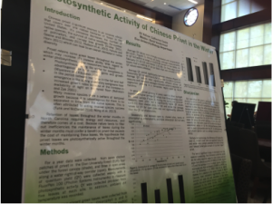
 I saw another poster that also had a lot of information condensed onto a small space, but this one worked a little better because of the systematic color scheme. In the image on the left, the author chose green to highlight the section titles, and she outlined the bottom in a transparent green to continue the theme. Since her presentation was on photosynthesis, the color choice was not only relevant, but it also served to emphasize the topic of the poster. This visual presentation did a really good job of incorporating the contrast and repetition elements of the C.R.A.P principles of graphic design because of the green color and the consistent section headers. However, this poster did have a scatterplot right in the middle of the page, which cluttered up the central focus point of the poster and distracted from the highlighted bullet points.
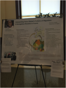
The final poster that I will bring into my discussion is a poster that addressed all of the C.R.A.P principles (contrast, repetition, alignment, and proximity). Compared to the other posters I discussed above, this poster (left) seemed rather simple. However, this simplicity actually enticed more audience members because it was not too overwhelming. The text and images aligned nicely and complimented each other well. Additionally, the format of the text was repeated throughout the poster, which kept the visuals consistent.
 The most rhetorically interesting part of the poster, however, required the viewer to pay careful attention. At first, I thought that this poster did not do a good job with repetition because the colors of the text were different for every section, and I did not understand the reasoning behind that decision. However, upon closer inspection, I realized that the colors of the text came from the different colors of the map about Senegalese migration. This rhetorical decision subtly highlighted the map and drew attention to the most important features of the image.
Overall, I was extremely impressed with the SURF presentations that I saw, and I am excited to hopefully become a presenter in the next few years. Seeing the posters today and noticing which elements made the posters rhetorically effective helped me understand the importance of making a poster visually appealing as well as academically engaging. Perhaps not everyone who looked at the posters realized that the rhetorical decisions of the presentation made the difference between what they considered “good” and “bad” posters, but those choices were still important underlying elements. In other words, the rhetorical language gave the posters the extra push they needed to be engaging, effective, and appealing.

 Follow