Sarah Paterson ENG – PWR ‘15
Welcome to Visual Rhetoric week on the CUPID blog! I’m going to kick it off by talking about typography, one of my favorite subjects. For a casual document designer, font is typically something chosen by instinct. Certain typefaces seem to say certain things, and while one might suit your situation perfectly, another may be entirely inappropriate. For instance, you’d never see a wedding invitation written in Comic Sans, unless the wedding was between two cartoon characters and held in a clown car.
But while we might know these things about type instinctually, there are more technical reasons for why we choose what we do! Here’s some important terminology that will get you talking like a typesetter:
Font vs. Typeface: Time for some nitpicky history! Most people refer to a kind or style of type as a “font.” This isn’t technically correct – a style of type, like Garamond or Helvetica, is actually called a “typeface.” Something like “Garamond bold size 14” would be considered a font. This goes back to the original days of print, when each individual letter required a different block, or “face,” to be set on a printing press. Together, all similar letters of one “typeface” would be a font. However, since the rise of desktop publishing, the two terms are often used interchangeably.
Serif: A serif (probably from the Dutch word schreef, meaning “dash”) is the little foot or dash that finishes off some letters. Typefaces that include serifs (like Times New Roman) are typically used for body text, since it is widely believed that serif fonts are easier to read in large quantities. Serif fonts are also often considered more serious or academic. Web-text often uses sans-serif typefaces, or typefaces without the dashes on the end (like Arial or Verdana). Some typefaces are also referred to as “slab serif,” which means the dash on the end is thick and heavy (think Rockwell or Playbill).

A slab serif font example
Decorative: This includes any number of illustrated or special fonts. These are often used for movie titles and brands, because they are made special to serve a specific purpose. Basic decorative fonts in Microsoft Word include Jokerman, Broadway, and Curlz. Some decorative fonts can get ridiculous – here’s a page full of Halloween holiday fonts, one of which is just a different jack-o-lantern smile for each character (though that would be called a “Symbol” typeface).
Script: Script fonts differ from decorative fonts in that people can hand-write (not draw) them. Handwriting, cursive, and calligraphy typefaces fall under this category. Fonts like these are appropriate for invitations, graphic design work, or even for personal branding. Make a typeface of your own handwriting here (and if you’re feeling fancy, you could even make a decorative one)!
Swashes and Ligatures: Opentype fonts (saved as .otf) often have additional characters called “swashes” and “ligatures” that can be used to replace serifs and connect letters. A swash is exactly what it sounds like – a decorative swoosh to replace a serif. A ligature takes the place of a serif and joins two letters together that wouldn’t ordinarily be joined. Most desktop publishing software gives you the option to use these characters – if you’re interested in trying out ligatures in Microsoft Word, go to Format -> Font -> Advanced, and it gives you the option to include any of a font’s available ligatures.

A very swash-y design example
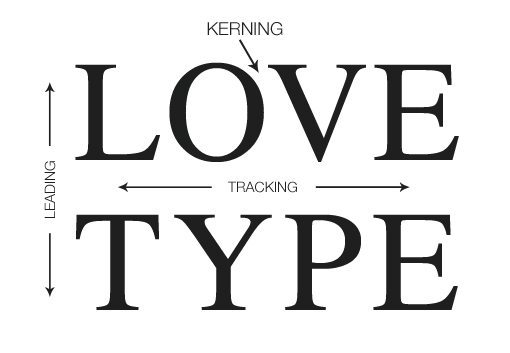
Kerning vs. Tracking: Kerning is the space between individual letter pairs, and is typically used to eliminate space between large overhanging capitals and the smaller letters beside them. Tracking does what kerning does, just uniformly over any number of letters.
Leading: This is the spacing between lines of type. If you want to squash your lines together or space them way out, a leading change is the way to do it. This can be easily done in Photoshop or InDesign (there’s a button especially for altering leading), but it can be done in Word too! If you go to format a paragraph (same place you go to change your research paper for class from single to double-spaced), the line spacing option allows you to enter your own line spacing value. Values above 1 stretch the leading out, and values below one (think decimal points) shrink it.

A useful diagram from designshack.net
Here are some useful websites so you can try out some new typefaces for yourself:
Free fonts:
100 greatest free fonts collection
Font ideas:
How to use alternate characters
Photoshop text effect tutorials
Happy typing!

 Follow
One Comment
As a person who can very easily spend an hour perusing DaFont.com for the perfect header “font” (or I guess, typeface) for a flyer, I thought I knew most of what there was to know in this area. I was wrong. The difference between font and typeface was never clear to me before. I had always known that font was used interchangeably- and many times incorrectly- but I never understood why…until now! I also really liked the inclusion of the general rules for using serifs versus sans serifs. After I learned this rule, I have found that I can enhance the visual design of documents just by purposefully using a certain type (like sans serifs for headings and serifs for body text). It is amazing how big of a difference font can make, and how much of a role you can play in altering font to behave how you want it to, like through playing with the kerning. I have found this immensely helpful, especially when I download funky fonts and don’t like how they look exactly.