Hello everyone!
To continue our week dedicated to the exploration of Visual Rhetorics, consider this: there are a number of logos used by uber successful corporations that are branded without text. What? How can this be? It appears that social recognition has been conditioned to the extent in which we recognize many brands by merely their visual based logos.
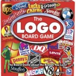
 Some like Starbucks and Chevrolet have recently removed text from their logos, whereas others like Apple have not had text in their logo since 1970. In certain approaches, Windows has never utilized text in their particular form of visual branding! There is even a board game dedicated to the testing of one’s brand recognition 1! Interestingly, some of these visual based logos are manifestations of symbols that lead to obvious suggestions (apple for Apple, window for Windows, etc.), while some of less distinct and rely more upon social recognition (Chevrolet, Starbucks, etc.). It seems that Facebook and Twitter fall somewhere in the middle, in that their logos are recognizable for both the suggestive image but still rely upon the company context 2.

With such an evolution of social recognition, it can cause one to ponder. To what extent, will companies utilize text in their future logos? Are text-less logos a way of the future? Is text an outdated element in visual rhetoric? Is the lack of text a suggestion for future endeavors, in that visual rhetoric will incorporate less text and more image recognition? As we create our own logos within PWR classes and for our own personal interest, it will certainly be interesting to see their progression and consider the influence of external companies.

 Follow