To continue our week of personal design, Danielle Deavens writes about how to incorporates personal design into a resume, with a consideration about how creative to be.
“Resumes are intended to be an at-a-glance representation of its writer – a page long document capturing the relevant experiences had by its creator. This is not an opportunity to converse with potential employers or graduate school admissions counselors. Rather, it is a short explanation of how the applicant has gotten to where she or he is today, and how that qualifies her or him for a certain position. As professors and professional development advisors often say, it is important to set your resume apart – but how much is too much? How far should you go to make yourself memorable before you risk jeopardizing the document’s ability to speak for you?
Context is key. As with any writing project, it is critical to assess the context in which it is written as well as the context in which it will be read and used. Some over-the-top resume designs are successful because they are appropriate for the intended company and position. For example, job-seeker Nick Begley became an internet sensation after posting his ‘candy bar resume’ on Reddit. Though he eventually scored a job using good, old-fashioned networking skills, his resume had the potential to be just as effective. As someone looking for a job in marketing, Begley’s chocolate bar resume idea shows the appropriate amount of enthusiasm and creativity. If he were looking for a job in finance, however, maybe a single piece of white paper would have sufficed.
Just as we must decide what we include on our resume based on the audience, we must also decide how we will design it based on the expectations of the reviewer. Moreover, we must recognize that resume design conventions have been created for a reason: the more creative we get with our resume design, the more we have to contend with decreased readability. While this resume has a distracting level of creativity, this resume is able to organize the creative design in a way that is not distracting. This one bends design conventions to allow creativity and readability to coexist on one sheet of paper. And this one? Well, just see for yourself…
http://www.today.com/video/today/51132075#51132075
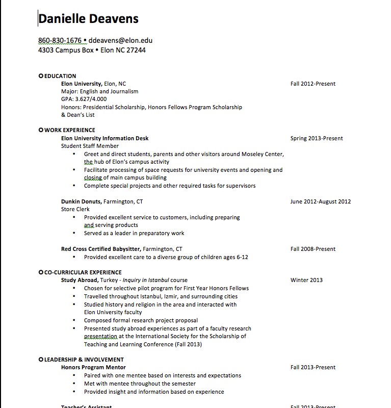
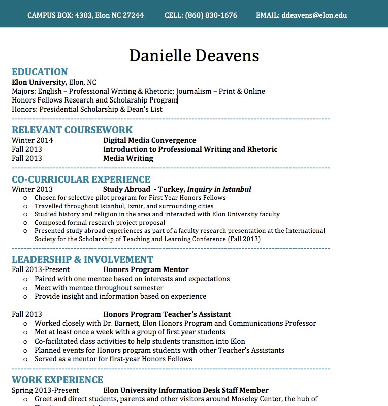
In recent revisions of my resume, I have come to understand that adding personality can be just as important as reassessing what content is included. I focused on these two aspects, content and personality – specifically color – for my resume update. First, I had to choose a color that would invite the reader to learn about me but would not hinder the readability of the document. Next, I decided just how much color I should add. As a general rule, all of the headings and subheadings probably should not be in the color you choose. You want your resume to pop, not offend. My final task was assessing the relevance of my content. I eventually chose to remove my babysitting information from the “Work Experience” section so that I would have room to add “Relevant Courses”. I also put work experience at the bottom and relevant courses just below education. See the before and after photos below. Though everyone’s resume-writing process is different, color and content are important elements to consider when adding creative flare any document.
BEFORE
AFTER
Here are some tips for success with creative resumes:
- Always be mindful of your audience. Feel free to have multiple versions of your resume for different types of reviewers.
- Design your resume to work best in multiple formats. Some of your design components may be altered when switching from a Word Document to a PDF. Remember this when sending an electronic version.
- Choose a certain design element to play with and run with it! Color can be a great way to make your resume stand out. Decide on a color that you think fits your personality and use it in select areas throughout your resume.
- Personal branding is the goal. Just like your electronic portfolio, LinkedIn account, and cover letter, your resume represents you. Work on creating a logo or a watermark to include on all of these platforms. If you truly want to stand out, make yourself memorable with a trademark symbol. “


 Follow