
This is something I’ve always been in tune to and have been known to ruin a movie experience or two by judging a movie solely based on it’s intro. When Blockbusters existed I remember walking up and down the aisles just fascinated by the covers of movies and have definitely been known to judge a book by the cover and which font they use. I read this article a while back about the top two fonts used for movie posters and of course Helvetica was one of them, showing up in almost 1/3 of all professionally designed movie posters we see at theaters. That’s for sans-serif movie posters, if it’s serif you’re going after, for the more horror, dramatic film it’s typically Trajan.
I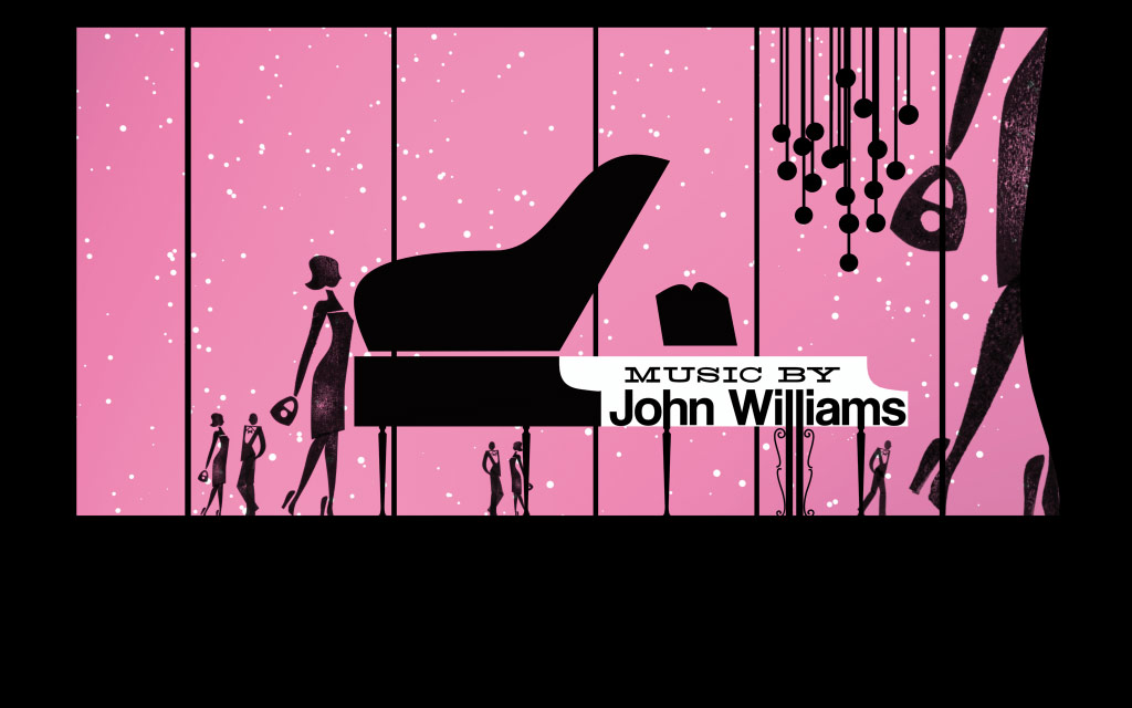 t’s only realistic to think that these same fonts and design principles would be carried over into the title or movie trailer of major motion pictures. It’s interesting, usually low budget films spend a lot of time and consideration for their introductions, not so much into the animation, but the typography choice. One of my favorite intros of all time is to the Leondardo Dicaprio classic, Catch Me If You Can. I think it has a brilliant mix of type play and animation and does great job of setting up the movie.
Since I’ve been dabbling in After Effects, things are starting to make since on how to make my Illustrator files move. I think that it’s an important skill to have, not only for movie titles but for web design, graphic design or any field in this industry. Things that move are always more interesting that things that don’t move.