
The new form of journalism and information output is becoming more and more visual. The bar graph or pie chart are being re-imagined to fit into certain categories, apply to various topics. All in the effort to make information more relatable and assessable. Especially in the journalism field, the once dry and adult-only based medium is transforming into a fun and visually stimulating soiree of information. Data can be reconfigured to be read by even the most illiterate of society. All in the hopes to change the flailing industry. It is no secret that newspapers, magazines, and journalism as a whole is falling by the wayside of the internet powerhouse. They had to reinvent themselves to appeal to new audiences, make themselves relevant in the new era of the web surfer. And what is the best way to do that, by making the product or information something to see. Appealing to the eye in a way that makes people WANT to look, WANT to take notice and learn. Its all about manipulating the consumer in a way that makes it appear as if they are deciding free of supplier machinations. The best part about visualizing data is that it becomes art. People want to look at it again and again, putting it on their walls and sharing with their friends. I personally love visualized data because you can constantly come back to it if you forget a fact or figure from a topic you found interesting. Much like this graphic that I find very useful.
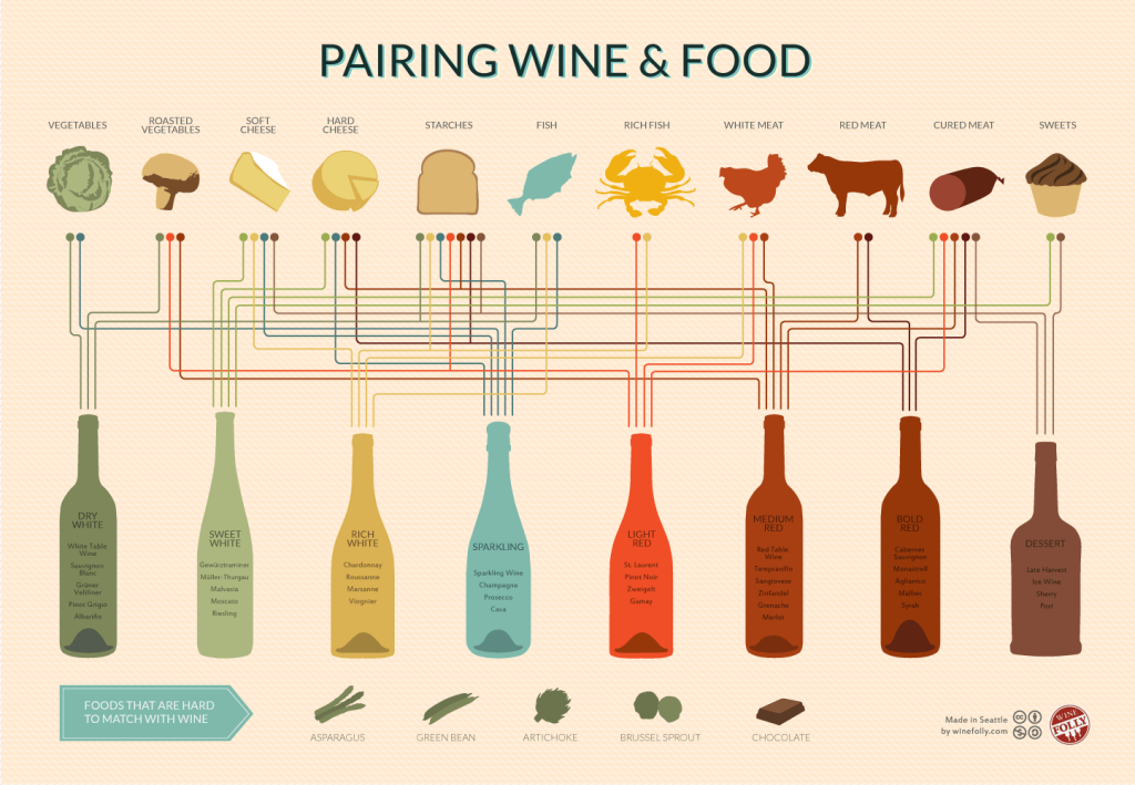 This lets me know what kind of wines go best with which foods which I always go back to or pull up on my phone when I’m deciding on a wine for dinner. I personally love info graphics and find them useful, fun and astoundingly well made works of art. It is an amazing new trend in journalism and information output, that will, in my opinion, only grow bigger and more widespread.
One Response to Journalism In the Age of Data