NERD ALERT.
The amount of glasses, beige cubicles and beige articles of clothing is overwhelming in this documentary. Although Nigel Holmes is really trying to recapture his youth with that multicoloured hoodie.
However side stepping his clothing choice, Nigel brings up the a good point of Data Visualisation. I love charts, infographics, grids, pie charts and so on. I think that they are an extremely useful and accessible way for the everyday person to break down and understand complicated statistics and numbers. I think it is one of the most effective and efficient ways of delivering information, however a large majority of the time these data visualisations can be overwhelming.
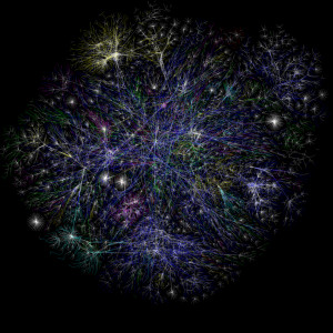
Here is a data visualisation of every page in the internet. This apparently represents the 14 billion pages on the internet. However if I came to you and told you my 5 year old cousin blew through a straw with some paint and spit you would probably also believe me.
This is where I think that data visualisation can become dangerous, a lot of people will choose what they want to believe. Data is driven by numbers, people trust numbers, therefore if it is printed in a credited newspaper or an online journal, why wouldn’t we believe it? but many can be inaccurate or selections of data without the big picture. With pictures like the above however, people tend to reach too far to convey too much information.
Infographics and interactive infographics however I believe have the ability to become almost some of the most useful techniques to convey information. Nicolas Felton might have taken it to an extreme (and might want to see a therapist about his excessive documentation/get a girlfriend), however he embodies how obsessive our culture has become with information broken down in such a way, and a good way I believe. This modern way of getting statistics and bite sized information to the public can only be empowering, and when it is done in an creative, aesthetically pleasing, and with specific context and meaning, this only makes the information more powerful.


One Response to Data Visualisation