

What do our survey respondents look like so far?
Thank you
First, a big thank you to those 600+ of you who have taken the time to complete our survey. Yes, so far a remarkable 100% of those who started the survey completed it, spending an average of 35 minutes offering their thoughts and words. That everyone who has started the survey forged on to the very end is virtually unheard of in online survey research, especially with a long survey like ours which had 62 questions and encouraged written comments on most. Again, thank you to all the respondents for engaging our questions.
So, what do our survey respondents look like? They are dedicated, persevering, patient, and, based on the copious written responses, both thoughtful and generous.
As a research team we remain committed to hearing and reporting on your voices to the best of our ability.
A snapshot
Let’s take a deeper glance at what our survey respondents look like.
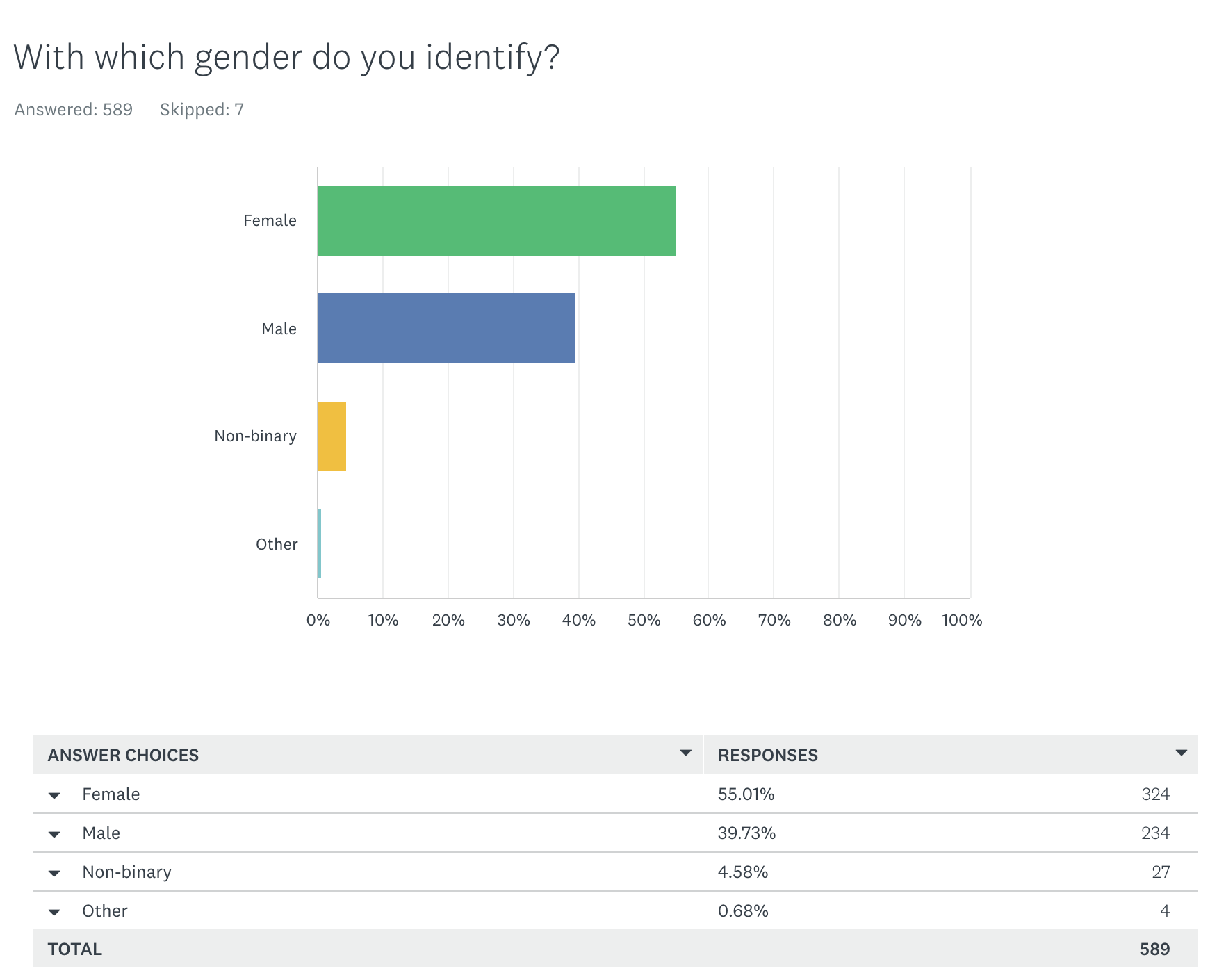
Mostly female
Our respondents are mostly female (55%), but with a good number of males (40%). Over 5% of the respondents checked ‘Non-binary’ or ‘Other’ indicating good gender identification diversity.
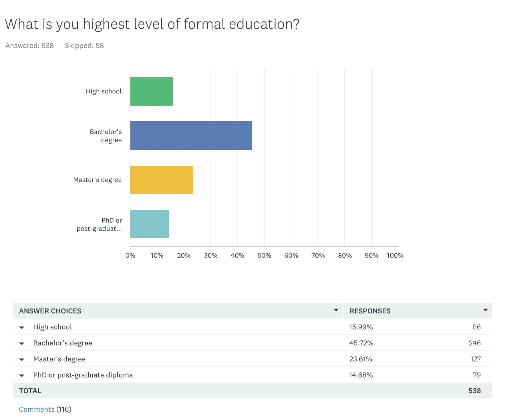
Well educated
Our respondents appear to be well educated, with nearly 15% with a PhD or post graduate work. The level of education is apparent in not just the volume of comments we have received but more so in the overall clarity and thoughtfulness of what has been written.
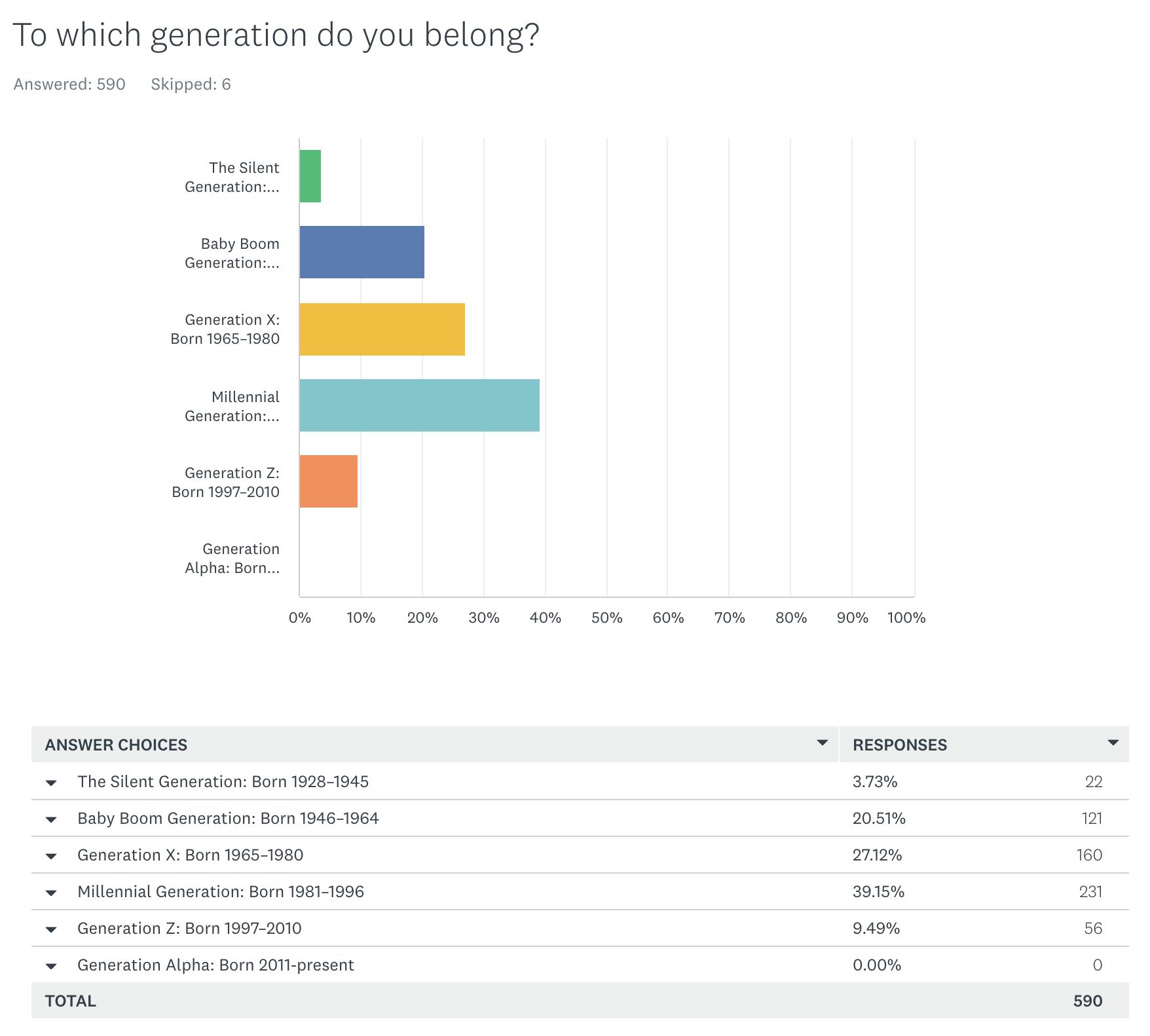
Mostly millennial
Our largest group are Millennials with 39%, but the older folk are well represented with Generation X at 27% and Boomers (like myself!) at 20%. The younger generations are lagging behind, with only 9% from Generation Z and none (as could be expected) from Generation Alpha.
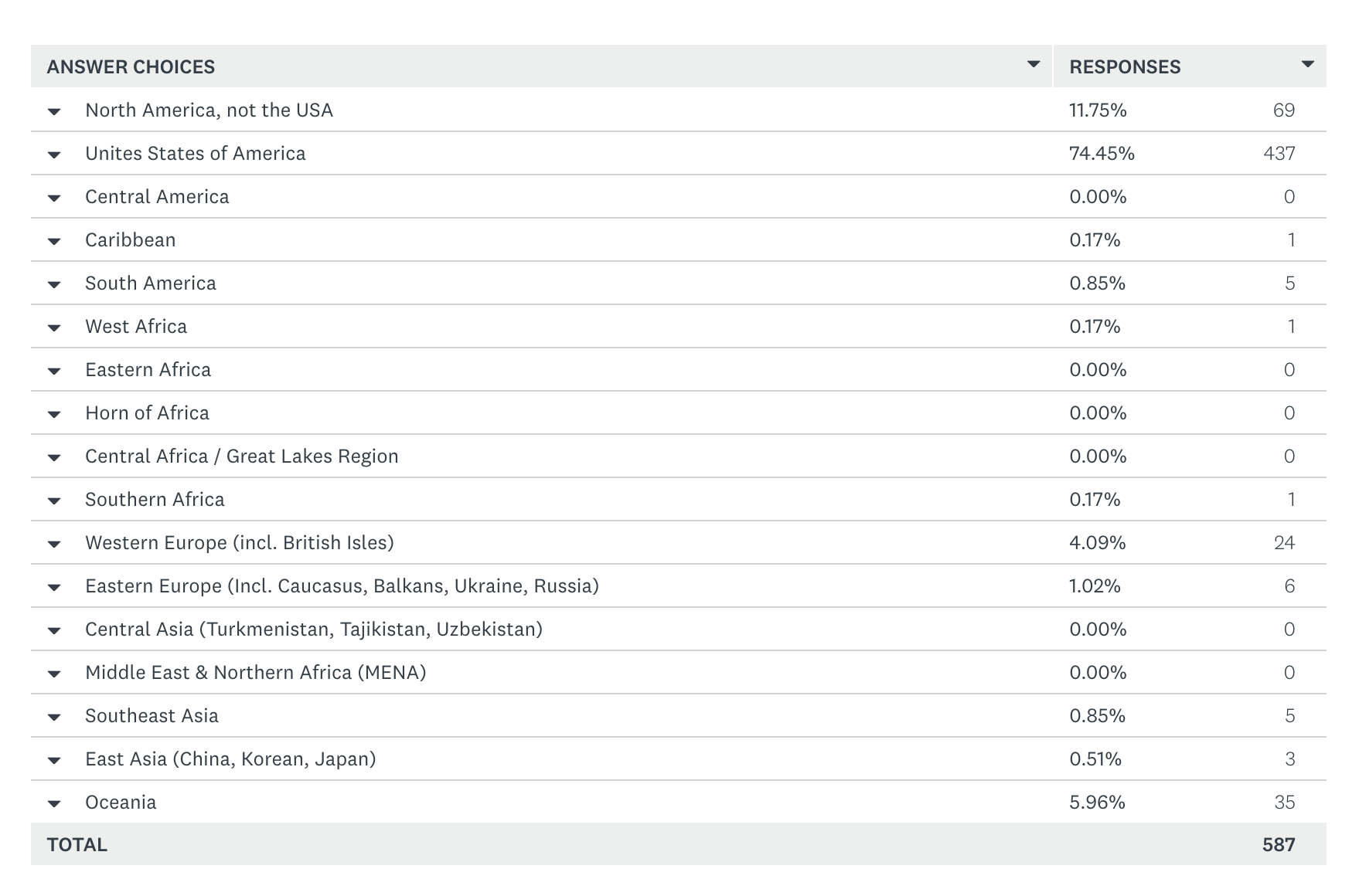
From all over, but mostly the US
We asked, “In what region of the world do you currently live?” A larger majority of our respondents -74%- are from the USA and another 12% from Canada. The remainder of the respondents live in Oceania (6%), Europe (5%), with the remainder spread across the globe. Given evidence from the traffic on our blog site I think it safe to assume that the vast majority of those from Oceania hale from Australia.
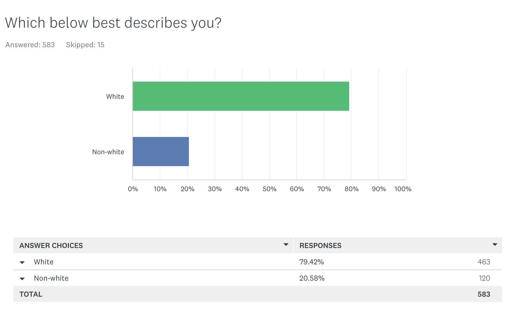
Mostly white
In a previous post titled “One size does not fit all” I explain our unique approach to the question of race. To this point in the data collection process our respondents are indeed overwhelmingly white. Perhaps as word of this survey gets out to different geographic and demographic groups we will see greater diversity. The responses to the question following “Which best describes you?” are fascinating thus far. This question asked, “Please use the space below to (1) react to the inappropriateness of the choices in the question above and (2) describe how you identify yourself based on common cultural-linguistic, ethnic, racial, tribal, national or other categories.” I’ll report more on these responses in a future post.
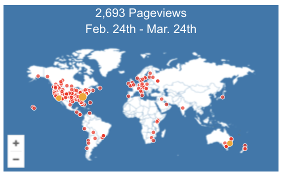
Traffic on the blog
As of this writing we have had a modest number of people visit our blog (2,693) reading our updates and comment. Visitors are mostly from the USA but there have been site visits from 34 different countries and from every continent except for Antarctica.
All for now
That’s all for just now. I will be updating this post in the near future. In the meantime please feel free to reach out if have any comments or questions. I can be reached at arcaro@elon.edu.
Again, thank you to everyone who has become a part of this project.
 Follow
I think your statistics are not tracking properly. I began the survey in early March, but did not finish it because there were not options to express my own relationship to the church. Your 100% completion rate is certainly not accurate.