
I never really paid attention to typeface. Well, not to the extent that someone could produce a 80 minute documentary on it. The documentary self-titled, Helvetica, covers the 55+ years of its existence, as well as, typography, graphic design, and global visual culture. From watching the documentary I never paid much attention to how often Helvetica is used in advertisements and signs.
You would have a better chance hiding from it, than it hiding from you because it is literally EVE-RY-WHERE. Some of the biggest companies use Helvetica font type, such as, Target, American Airlines, CVS/pharmacy, 3M and the list is endless.

This font occupies billboards, print ads, commercials and movies. But what makes this font type so loved? Wim Crouwel, a Dutch graphic designer and typographer, answers, “The meaning is in the content of the text and not in the typeface, and that is why we loved Helvetica very much.” Helvetica has a simple and clean design. The font does not take the shine from what you are marketing; it enhances it. That is why it is a favorite among advertisers and withstands the test of time.
I must confess, I was once one of those people that liked the funky fonts, like comic sans, but thank God for growth and wisdom. I thought using a standout font, would make my flyers and designs more impressive. Later to realize that standing out is not always a good thing. As a designer, one must ask themself, “What am I designing for?” and, “What message am I trying to rely through my work?”
As a designer, I have come to look at font types as having their own character and personality. When a font has too much character and personality it can take away from your message and your product. Your audience can spend too much time trying to figure what the font itself says because its design is hard to read or they can be mesmerized by the design itself.
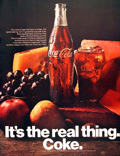
Graphic designer, Michael Bierut states his opinion on Coca-Cola’s use of Helvetica in its ads by saying, “It’s the Real Thing. Period. Coke. Period. Any questions? Of course not.” Helvetica delivers Coke’s message with grace and timeless style.