
Watching the documentary on information visualization obviously overwhelmed me so much that I completely forgot to write this blog post on it! I guess I needed some time to absorb what was happening…maybe!
 The information we receive today is full of numbers, statistics, factors, ideas and more. Not only do we view data at a national level, but people want to be able to view it at a state, county and city level as well. Many want to be able to see information that applies directly to them but also browse information for others. With that being said, how do we create info graphics that allow the user to learn all of these aspects of information without the data taking over the page and becoming unrecognizable?
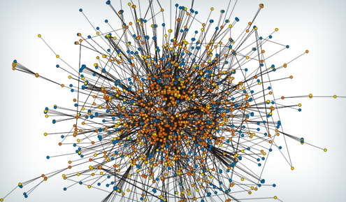
It was mentioned several times throughout the documentary that today’s trends in infographics do not necessarily circle around the idea of presenting data in an easy to digest manner. Instead, designers work to create visually appealing graphics and designs out of the data, however these images are essentially impossible to understand. If you look at some of the “out there” infographics they are eye-catching and spark your curiosity, however they appear to be more of an abstract piece of art you would hang in your living room rather than a form of information. Now, as a self proclaimed nerd I would love to have something like this in my house one day, but to others this way of visualization is impossible to read. This is the wall infographic designers face: take complex, detailed information and make it easy to understand.
There are several forms of information visualization. Not only can you create a static info graphic, but there are interactive graphics that can be placed on websites for the audience to play with in order to learn more. More recent trends include incorporating video and Adobe After Effects to create a motion infographic that are both informative and entertaining. Either way, one of the first things a designer should do before they start the design process is analyze the data they are trying to communicate. Create concepts for how you want to show the data whether it be a map, a graph, pictures or another form of info visualization. Designers also need to create a narrative to go with the graphic. Whether it is extra text that leads the audience in order to understand the information being presented, or content which supports the information being presented, there needs to be a narrative. Just like with almost every concept we have discussed in this class, you need to make decisions to support your work, don’t just make a decision to make a decision. If your information needs some text content in order for it to be understandable and more informative, then add it in order to improve your information.
Information visualization is a growing trend, however complex maps and interactive pieces cannot be created at the drop of a hat. Many online news sources have settled on creating simple templates that can be used for many different areas of information visualization. The foundational idea behind templates is ‘build one thing that can be used multiple times’. The designer simply needs to import that data and possibly tweek a few pieces of code in order to create the final product. Although the initial template may take several weeks to create, once it is completed it can be reused and reformatted in several different ways in order to convey information to the audience. There are also several different types of programs and codes online that developers can use to create their own infographic. To hire a information graphic designer does cost a lot of money and as said earlier, time is of the essence in many of these situations. With online programs and code, developers can create infographic based on their personal data easily. There is a bit of a learning curve to this style as well, but when implemented properly they can create unique information visualizations. One example
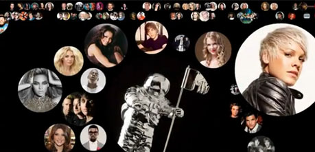
that I never realized was form of information visualization is the use of graphics to communicate ‘trending topics’ on social media such as Twitter. Each celebrity as a ‘bubble’ and based on the amount of Twitter traffic referencing them determines how large the ‘bubble’ becomes. I have always seen these graphics on entertainment websites, but never took into consideration the programming and science that goes into it. These templates becoming more and more popular and although at times they are difficult to read, they convey a simple message about who is trending when.
At the end of the day, the best approach to information visualization is to organize, understand and display the information you are trying communicate in the best logical way. While some information graphics can be visually interesting and appealing, they are impossible to understand. Organization and simplicity is key in order to create the best graphic for the audience. Finding the balance between visually appealing and visually understanding the data can be difficult, but when executed properly it can hold great meaning to the audience.