By Gina Apperson
I studied Gestalt Principles in my Digital Art class and my Digital Media Convergence class, but I think Andy Rutledge created a series that made the principles very memorable and inspiring. I enjoyed seeing the examples he used, which included graphics, screenshots of websites and even video. It proves that these principles are critical in all platforms of creative media.
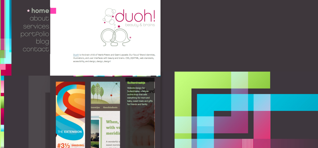
I was particularly inspired by the website designs he showed us. Veerle Pieters’ Duoh! site really stood out to me that I had to click on it and scroll through the pages.
I liked what Rutledge said–that this design breaks some design rules but does so in a way that fulfills other underlying design principles and concepts. I decided to examine this website based on the other Gestalt principles to see how this design works and captures my attention.
5 Principles Seen in the Duoh! Website Design
1. Law of Prägnanz: This law states that we tend to view complex images as simple and complete. Looking at the left side of the website with the series of colorful rectangles of varying sizes, we can see that although this is a complex set of elements, it can be interpreted as a simple rectangle that borders the side of the page.
2. Figure/Ground: Rutledge explained how this design integrates elements of the background into figures of the foreground and vice versa. But by doing this, the elements map out a story on the website and can guide the reader through the content.
3. Proximity: We can see proximity in how the navigation buttons are placed close to one another to group the idea of navigating throughout the site’s pages. Going a little further, we can point out how proximity is important with the formation of text and paragraphs throughout the page.
4. Common Fate: We can see a slight visual movement the blue, green and pink lines create on the right side of the website. Due to their similarity of movement we can see how they are related to point us to the important content of the site. Also, when hovering over each of the photos of portfolio pieces, a black background with a caption and link appears over each photo. This movement happens with each photo, which allows the user to see that these photos encompass related pieces of content.
5. Similarity: The website shows examples of similarity of size, color, shape and more. Like the example of proximity, the navigation buttons show similarity of color and size, which helps us group them together. Also, the large green, blue and pink rectangle elements have similar size and shape, which is why we can see them as one design element. Dissimilarity also helps us navigate this page. For instance, the contrast between the white background for the content of the page and the dark background behind that allows us to distinguish between the most important elements. The rectangle photos that show portfolio links also use the sense of similarity with size and shape.
When first looking at Veerle Pieters’ Duoh! site, I thought it looked complex and complicated. But after learning about the Gestalt principles and how universal and simple they can be, I was able to uncover the art and the science of this website design.
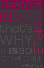
Just like a quote from the Duoh! website, said:
“Design is so simple, that’s why it is so complicated.”
-Paul Rand


