6 tips for making effective infographics
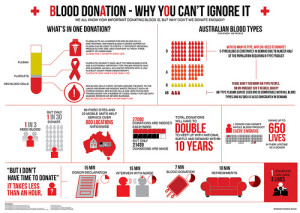 If you’ve been searching for a creative, visual way to present information to your students, you should look into creating an infographic. Infographics are structured graphics that convey data or knowledge quickly and clearly. With the help of online applications, anyone can make an infographic, but it is just as easy to create bad one. Here are six tips for creating effective infographics.
Choose your content carefully.
While you may want to include a lot of information in an infographic, less is more. Too much content within the graphic could clutter it and minimize its impact. Think of an infographic as a well-designed PowerPoint slide. It acts as a snapshot of information that communicates a specific message. First, choose what topic you want your infographic to cover and then only include the main bullet points for that topic.
Your visuals should reflect your content.
Infographics offer an opportunity to creatively express your topic. For example, an infographic about the skeletal system could be built around an image of a skeleton. Building an infographic around a content-related image could give people another way to learn your information through visual association. However, stay away from thematic templates if they do not match your topic. Graphics that do not relate to the information could confuse the intended audience rather than help their learning.
Take advantage of sections.
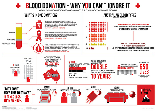
Utilizing sections within your infographic can organize your information in a way that is clear and easy-to-follow for people. Once you’ve decided on the information you’re going to include, you can categorize it into sub-sections that express similar ideas. Separating your facts into smaller segments gives you a way to create space within your graphic. Space will prevent the infograph from becoming too cluttered. Line breaks and color blocks are easy ways to create sections within an infographic.
With text and color, simpler is better.
With any infographic, simplicity will keep the image clean and clear for everyone who sees it. An embellished font may seem engaging, but could distract people from what you’re trying to say. Choose a clean, simple font that is easy to read.
Too many colors can also take away from your overall message. You also want to avoid using color combinations that make words difficult to read. With your color scheme, choose a palette of two or three complimentary colors that looks good together. This will make the infographic look consistent, and hopefully, easy to read. If you need help with choosing color schemes, resources like Adobe Kuler can show you the best combinations to use.
Don’t be afraid to use images, too.
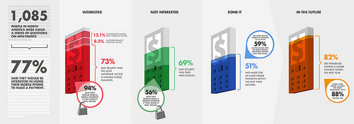
Using images within your infographics can also illustrate your point and create opportunities to break up the text. Many infographics employ charts and diagrams to convey information. While this may not be appropriate for all infographics, ones that use statistics or percentages may benefit from using images to depict the data.
Use examples for guidance.
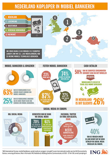
With all its parts and possibility, infographics can seem intimidating to create on your own. For any uncertain user, the best way to learn is look at other infographics for inspiration and guidance. While we have included a few here, there are thousands all over the Internet. There might even be some in your area of interest.
Do you have any tips for creating effective infographics? Let us know in the comments below!
First/Last image via Flickr user Nicholas Taifalos / CC BY 2.0 – Second image via Flickr user ukhomeoffice / CC BY 2.0 – Third image via Flickr user GDS Infographics / CC BY 2.0 – Fourth image via Flickr user Ken Shuman / CC BY 2.0 – Fifth image via Flickr user Ken Shuman / CC BY 2.0 – Sixth image by Flickr user ING Nederland / CC BY-SA 2.0



 Follow

