Katherine Makepeace PWR & Lit ‘15
Ideas are not always linear. So wouldn’t it be great if there was an easy-to-use program that would give you the flexibility to display your ideas more naturally than with a typical, chronological slide show?
If you’re unfamiliar with Prezi, let this be your introduction. This walk-through will outline the basics of creating, organizing, editing, sharing, and presenting a Prezi to enhance your audience’s understanding of your content. We’ll go over the following topics:
- Why Prezi?
- Getting Started
- Templates
- Basic Editing
- Sidebar Tools
- Theme Customization
- Adding Media
- Presenting & Sharing
- Other Editing Features
- Published View
- Things to Keep in Mind
Why Prezi?
Prezi allows much more flexibility than a traditional PowerPoint. It has numerous (and growing) template choices you can choose from to enhance your ethos. The variety of themes allow you to present non-linear concepts such as:
- Multiple solutions or potential choices (i.e.: “fork in the road”).
- Growth (i.e.: “sprouting tree”).
- Interconnecting concepts (i.e.: “webs”).
Prezi also allows the user to easily create and edit an engaging alternative to a traditional PowerPoint, made possible by enhanced movement, flexibility, & a user-centered interface and product.
Getting Started
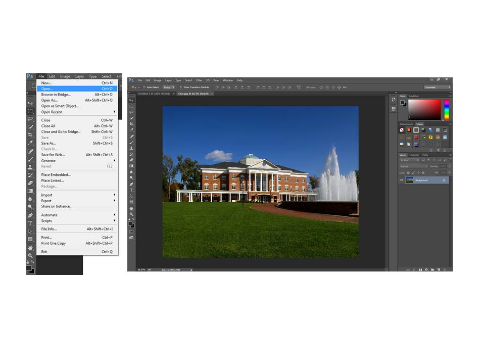
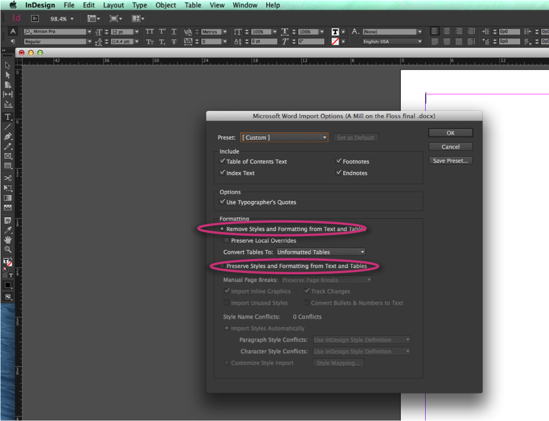
Creating a Prezi account is simple. Go to Prezi.com and click ‘Get Started’. Then, choose your preferred access. Most people choose the free subscription, especially students, as it is perfectly functional and chock-full of features on its own. However, be aware that your Prezis will be open for public viewing. You must choose either the ‘Enjoy’, ‘Pro’, or ‘Teams’ subscriptions to make your presentations private, but this costs a monthly fee.
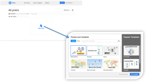
When you make this decision, simply fill in some basic information. Your new Prezi account will open to your Prezi library [see photo below], where all of your Prezis will be displayed and stored. From here, click ‘New Prezi’ to choose the desired template for your “canvas”.
Templates
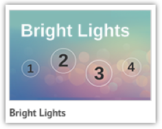
There are many things to remember when you choose a template, especially with the many visually enticing options that Prezi gives you. You want to ensure that you are amplifying your audience’s understanding by choosing a design and format that properly illustrates your ideas, rather than just picking a template with the prettiest colors. You can always change your color scheme later, add images, and customize pretty much anything about your Prezi later on. Having a base structure that suits the natural flow of your ideas is helpful to establish in the beginning. I chose the “Bright Lights” template for the purposes of this tutorial because it is basic and best serves the purpose of showing you how Prezi works.
 Basic Editing
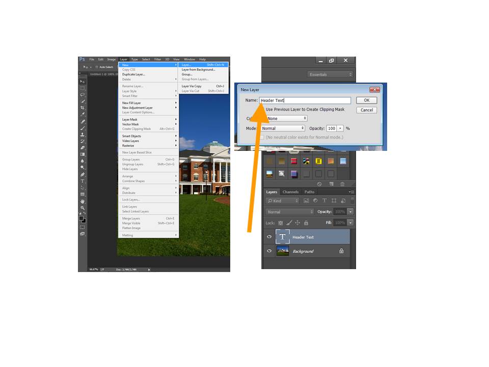
Below is the main editing page, followed by 2 images of the text box that contains your title.
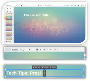
The first image is of your “canvas”. Your presentation will move within the confines of the canvas, so that your audience can see how your ideas form a bigger picture. It contains options to edit your Prezi’s appearance, change your “path” (the order in which you present your “slide frames” within the canvas), add and change shapes, and present or share your project.
The interface is rather easy to use once you become familiar with it. There is a top toolbar and a side toolbar, and we will go over the many customization options they provide later on.
When you edit your title, the template you have chosen will automatically have an appealing font selected for titles, subtitles, and body text. You can click the text box once to drag it anywhere on the canvas, as seen in the 3rd image. From here, you can also choose to edit the text, which will display the text-editing options evident in the 2nd image above. These tools are just like those in Microsoft Word, allowing you to alter the format of your text as you’re already used to.
Sidebar Tools
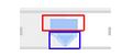
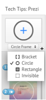
From the side toolbar on your canvas, you can do 3 things. First, you can change the frame-shape of each slide or make them invisible, as shown:
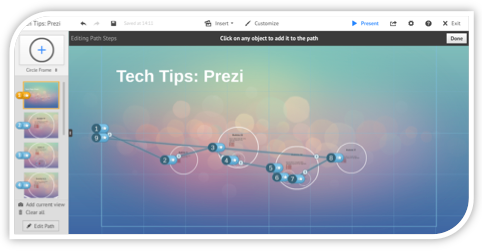
Second, you can click a slide to zoom to it and edit it. You can also alter the order in which you present your slides by simply dragging and dropping slides into your preferred order. Third, you can click ‘Edit Path’ to see an overview of how your path is currently set up:
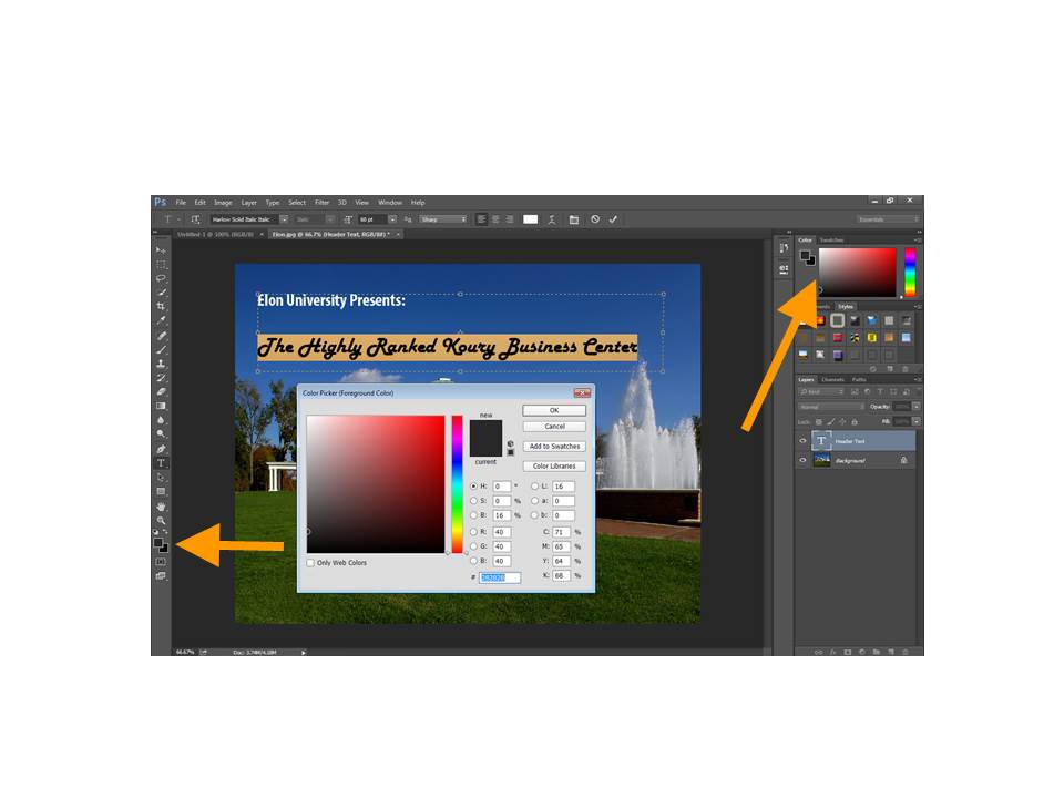
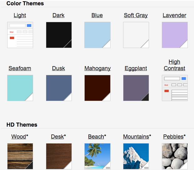
Theme Customization
The rest of the tutorial will now focus on how to use the top toolbar. To customize the colors or background of your template theme, click ‘Customize’. A new sidebar will appear on the right side of your screen. From here, you can add a background image or select from a library of different color schemes:

You can also add this customized theme for later, if you’d like to use it again.
Adding Media
You can add almost any media you want to a Prezi including YouTube videos, audio files, images, shapes, and even clip-art. Simply select the ‘Insert’ button on the top toolbar. Below, I show you where this option is located, and how to add ‘cute’ clip-art if the need arises:
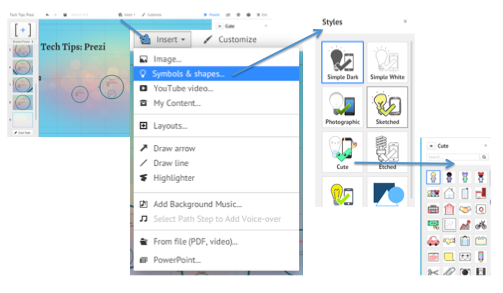
This is simply a feature that few people use, so if anything it’s just interesting to know that it exists. There is clip-art of all kinds available depending on how you are crafting your particular ethos.
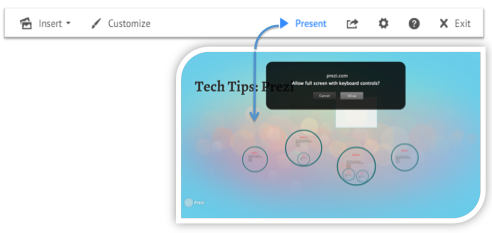
Presenting & Sharing
The top toolbar has a simple, one-click option to present from you computer. You can open access to your keyboard to move along the path of your canvas with any key.
Next to the ‘Present’ button is the ‘Share’ icon. From here, you can share your Prezi with a URL, present it remotely for up to 30 invited online audience members, or share it directly to Facebook.
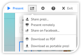
Additionally, this is where you can download your Prezi as a PDF. This can be useful for displaying it on your digital portfolio or easy sharing with others. You can also download a portable version of your Prezi, which is basically a file you can send to others without sending them directly to your Prezi account’s URL.
Other Editing Features
The gear in the top toolbar allows you to change the screen ratio of your Prezi, in order to suit it for a smaller or larger screen. You can also enable keyboard shortcuts.
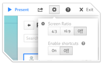
With shortcuts enabled, for example, keying in a capital ‘L’ will load a file onto your canvas, Ctrl+Shift+D will create a mirrored version of an image, and so on. You can access a video tutorial and a list of useful keyboard shortcuts by clicking the question mark in this menu.
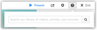
If you are having issues with your Prezi, you can click the question icon located directly in the top toolbar, next to the gear icon. This will summon a troubleshooting search bar, which will direct you to relevant articles and video tutorials based on your search terms:
The last icon on the top toolbar is the ‘Exit’ button, which will direct you to your Prezi’s Published View.
Published View
Now that you are finished with your Prezi, this is where people can access and view it via URL. If you have chosen a free subscription, like I said before, it is viewable by the public. This is where your Prezi can receive comments, and be liked or shared by yourself and others. It is also automatically “reusable” by others. To prevent someone else from using your Prezi, click the ‘Public’ button beneath the right side of your presentation:

This will present you with a pop-up, from which you can uncheck the reusable option to prevent this from happening if you want to keep a free subscription.
Things to Keep in Mind
There are 3 major things you should keep in mind when creating your Prezi. First, of course, I’d just like to reiterate that your Prezis are not private unless you pay for a subscription. Attach your name to it, and turn off the reusable option especially if it is for a school assignment. Although it’s unlikely, plagiarists could snag it if they wanted to and you wouldn’t know.
Second, consider how much you may or may not want to rely on Prezi’s fabulous templates. If the goal of your project is to show off your design skills, for instance, consider going with a blank canvas and building up a totally original design from there. If the focus of your presentation is your content, then you could choose to stick with a minimally altered version of a Prezi template so long as it enhances your audience’s understanding. Also, make sure your design is working toward audience understanding instead of using Prezi just for its flashiness.
Finally, practice your presentation a few times by yourself or for your roommates. The enhanced motion and flexibility afforded by Prezi can be engaging, but it can also be nauseating if you take advantage of this feature too much. Pay careful attention to how much movement helps or hinders your presentation. See if your design is helping to orient your audience in terms of your ideas – or making them generally disoriented and totally sick.