Guest Blogger Hope Kase
This week I wanted to discuss the process I went through in designing the logo for the new online English department newsletter, The Scroll, in my spring term ENG 282 CUPID Writing and Publishing Studio class. Our first group assignment was to completely renovate the newsletter, as in the past it had been a yearly paper publication that had a dated appearance and was not drawing in a large audience.
One of our first orders of business was to reconsider the name of the newsletter, which was previously “The Back Cover”. After generating and voting on names that integrated the new digital identity and sounded more modern and trendy, my idea of “The Scroll” was chosen.This title not only alludes to the old parchment scrolls that were used to write on centuries ago, but also to the way our audience will be accessing and navigating through the newsletter by scrolling through it online.
After deciding on this name, we realized that it needed a new logo to go with it. This logo would be the visual representation of the online publication, and would act as the recognizable and iconic symbol of the English department newsletter. When we began dividing up tasks for developing other parts of The Scroll, I knew I wanted to work on the logo. I have a lot of background in art, both on paper and digitally, and was really excited to try my hand at rhetorically designing something for the department.
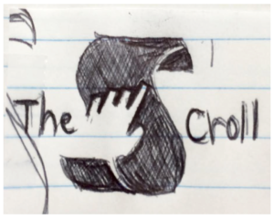
 In the invention phase of designing the logo, I worked with my project partner Ashley, and together we came up with over fifteen different graphic ideas. We discussed what our audience will find most visually appealing, what embodied the full identity of the English department and our publication, and what would be a functional and easy-to-recognize image that could be used across various media. My first draft of the logo design we ended up choosing as a class was just a messy pen sketch, but the idea behind it stayed the same through drafting.
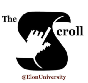
The basic idea for the design was to create an image was to mimic the ‘S’ of the word “scroll”, and be able to also have it as a symbol that could stand on its own. The main body of the logo is both an ‘S’ and a scroll, referring to the alternate meaning of the word. The cut-out of the pointing hand is a reference to the mouse icon on some computers when clicking on something, and here I used it to bring in the online theme as well as create the image of someone pointing to something written on the scroll. This symbolizes the way the newsletter highlights and “points out” important information about the English department for the audience.
 From there I used Adobe Illustrator to bring my logo to life (in a digital sense). After multiple trials, I came up with a few early drafts in varying colors. I brought these to class, and we discussed the strengths and weaknesses of each version. We talked about word placement, color schemes, shape, and fonts, and considered what was the most visually appealing. We decided that a maroon and black scheme was appropriate to represent the Elon English department. In the earlier drafts, the rest of the letters making up the words “The Scroll” were too far from the ‘S’, and it looked disjointed and hard to read. I fixed this issue and now the placement is much improved. We also decided that having the main logo and words colored black with the “@ElonUniversity” colored maroon was best. My classmates thought this was the easiest to read and looked most aesthetically pleasing.
When working on The Scroll’s logo, I improved a lot of skills. Working individually and with a group on a project using rhetoric, we constantly worked to find balance between the representations of audience, speaker, and subject. I was able to use my creative license to make something that not only helped my group, but will also be a representation of part of the department that I am a part of at Elon. The final logo ended up polished and appealing, and I am very proud of the work. After hours of brainstorming, experimenting on Illustrator, and our helpful class collaboration, it turned out to be a successful logo for The Scroll- maybe you recognize it!

 Follow