Carolyn Braganca
I imagine there are many who are at least familiar with the basic idea of visual rhetoric, if not the specific components. Likewise, there are also plenty of people who are aware of the high fashion world of Chanel, Dolce and Gabbana, and Tom Ford but are not familiar with the specific messages, campaigns, or ads of such brands. If you are unfamiliar with one or both of these concepts—visual rhetoric and fashion—well you are in luck, because this post will explain the four main components of visual rhetoric using high fashion advertisements as examples.
The first component is text, which involves using a particular font to convey the tone of your brand. In a very broad sweep, fonts are broken down into two different categories: serif and sans serif. Serif fonts include Times New Roman and Garamond and are so named because of they use serifs, which according to Wikipedia (http://en.wikipedia.org/wiki/Serif), are the “small line[s] attached to the end of a stroke in a letter or a symbol.” Serif fonts are considered more old-fashioned—possibly because they have a look of stability to them—and are generally required by many older and more traditional professors (though certainly not all of them) for papers. Conversely, sans serif fonts include Arial and the font of this post, and because they do not use the serif, they are considered more contemporary and less old-fashioned. However, if you read newspapers or some professional documents, you will probably notice it mixes serif and sans serif, so these rules are not hard and fast.
Using that very light crash course, you will realize you can tell a good deal about the broad tone of a brand by the font it uses—serif or sans serif, print or cursive, etc. The Gap, however, likes to throw its consumers off slight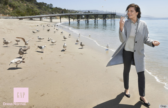 . Its current fall campaign is called “Dress Normal” and includes actors like Anjelica Huston and Elizabeth Moss. In its ads—which you can see if you flip through Vanity Fair or Vogue . . . or if you click here (http://www.huffingtonpost.com/2014/08/19/gap-fall-campaign_n_5691760.html) — viewers will notice the Gap logo uses a serif font while the ad’s slogan is a sans serif font. This conveys the brand’s interesting dichotomy between its desire to convey its tradition and history but also its desire to move forward and evolve with the world. Specific to the campaign, the mixture between serif and sans serif could also demonstrate the brand’s mixture of clothes that appeal to both older and younger consumers. After all, my mother and I both shop for clothes at the Gap.
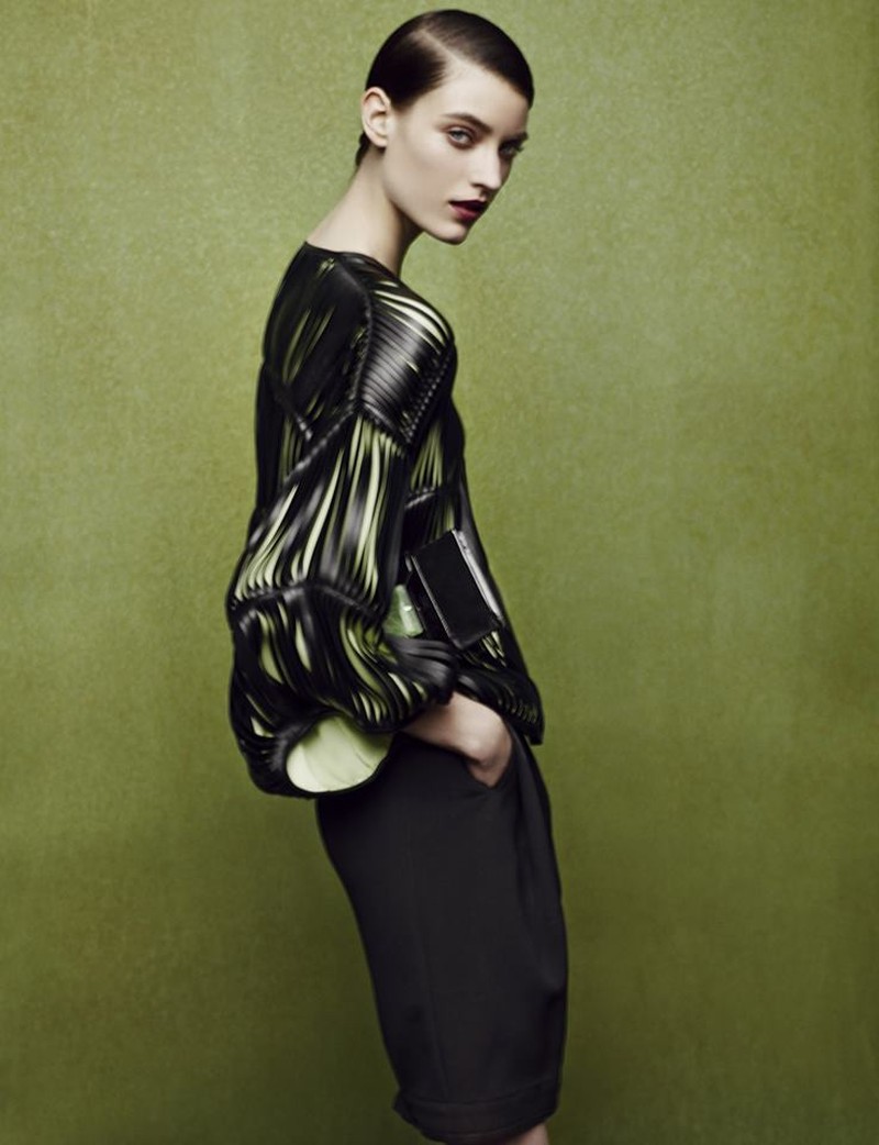
While text and font are used often to advertise the brand in advertisement campaigns, color and color contrast, the second component of visual rhetoric, are used typically to advertise the clothes, as Giorgio Armani does in his Fall/Winter 2014 collection. The collection is titled “Fade to Grey” and features mainly blacks and grays accented with a pale green. In both his advertisement campaign (http://alive.armani.com/news/en/the-new-giorgio-armani-fall-winter-2014-15-advertising-campaign/) and his fashion show (http://en.vogue.fr/defiles/fall-winter-2014-2015-milan-giorgio-armani-2/10978/diaporama/show-1442/15145/pag), the monochromatic clothes are contrasted and highlighted by a jade color. Why Armani chose these colors remains up to interpretation. At first, I interpreted the tone as jaded, which seemed to match the color palette as well as the models’ expressions, but it could also be a fade from the bright colors of spring and summer to the muted neutrals of winter. The fun part about color palettes is it is almost entirely up to interpretation.
Clothes, however, are kind of easy to advertise—models can make the clothes look fun and dynamic or classy and demure by posing as such. Color and color contrast are also used to highlight accessories. Look at Jennifer Lawrence in Dior’s Fall 2014 advertisement campaign (http://www.fashiongonerogue.com/jennifer-lawrence-be-dior-bag-miss-dior-fall-2014-ad/). Mostly, she is modeling handbags. But how do you make consumers look at a small handbag when it’s Jennifer Lawrence holding it? You use color contrast. With Lawrence clad in a simple black suit and standing in front of a gray background, a handbag of any non-neutral color will pop out.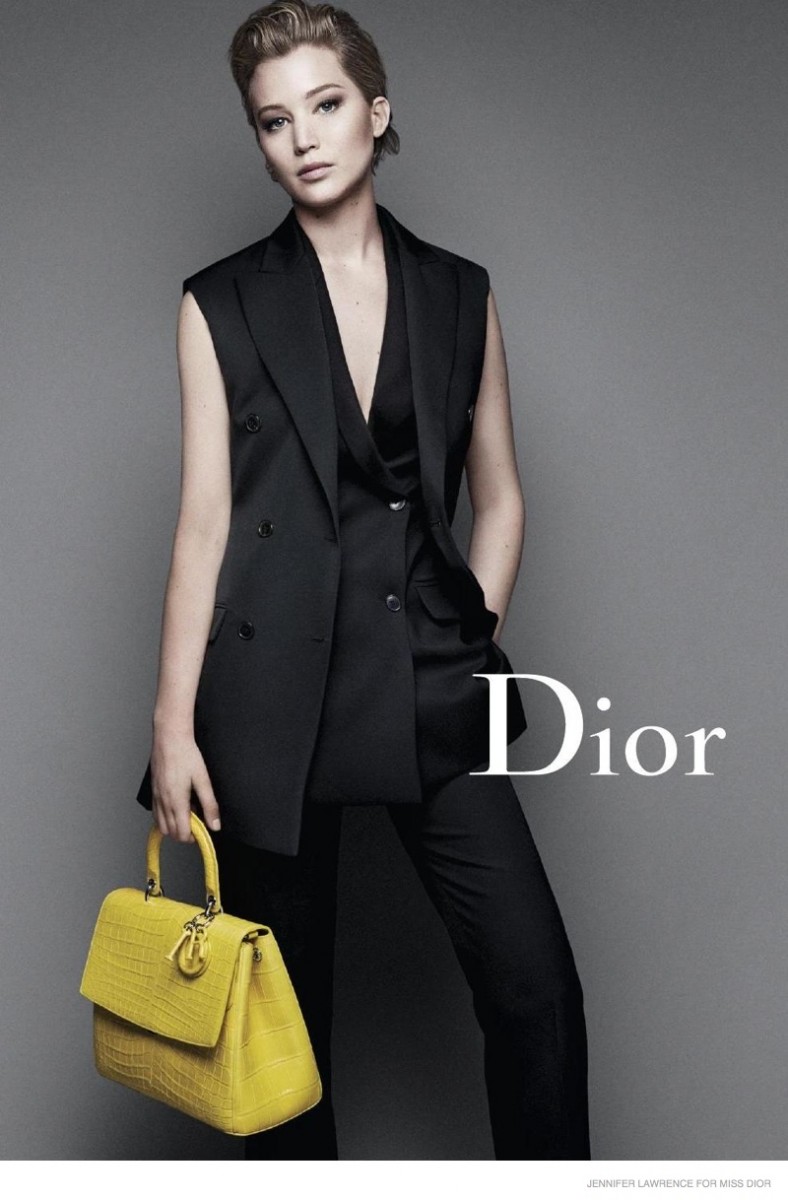
If you have to force the viewers to look away from Jennifer Lawrence, then why use her as a model in the first place? Why not use a lesser-known model? Jennifer Lawrence falls under the third component of visual rhetoric: visuals and graphics. This component seeks to use imagery to better illustrate a message. By using celebrities with public personalities and brands, the brand associates their brand with the celebrities’ brand. Take Michelle Williams as an example—she was recently singled out to be the face of Louis Vuitton’s Spring 2014 advertisement campaign (http://tomandlorenzo.com/2014/04/michelle-williams-for-louis-vuitton-spring-2014-ad-campaign/). You’ll notice that she is often wearing the same color or a complimentary color as the bag, thereby using color to associate her brand with Luis Vuitton.
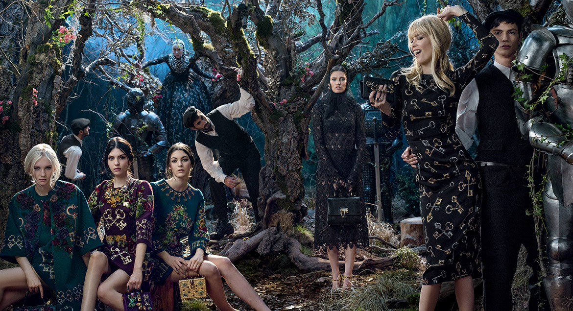
Another way to use visuals and graphics is through background images, which instill a certain atmosphere to the clothes. Dolce and Gabbana is particularly good at this, constantly using fun and captivating backgrounds to communicate the tone of the clothes. Their Fall 2014 ad campaign (http://www.dolcegabbana.com/woman/advertising-campaign/) uses an overgrown and wild looking forest with saturated colors as a background, but their Spring/Summer 2014 campaign (http://www.luxuo.com/fashion/dolce-gabbana-spring-2014-ad-campaign.html) uses an Italian home with bright colors and an overall golden glow. Another brand that uses very textured backgrounds to further visualize the brand’s clothes is Alexander McQueen, which used a very gothic setting in the Fall 2014 ad campaign (http://www.fashiontimes.com/articles/9899/20140717/alexander-mcqueens-fall-2014-ad-campaign-unveiled.htm)
Although something is in the background, that certainly does not mean it is simply ornamentation. Visual backgrounds, color and color contrast, as well as text can all be a part of the final component of visual rhetoric: design. This component centers around arranging an advertisement to draw the viewers’ eyes where you want them to look. As we saw with Jennifer Lawrence and Dior as well as the Gap ads, color contrast can be used to draw viewers’ eyes to the product, but not all advertisements seek to use a monochromatic palette purely to make products pop. Another way to use design is to use lines to direct eyes.
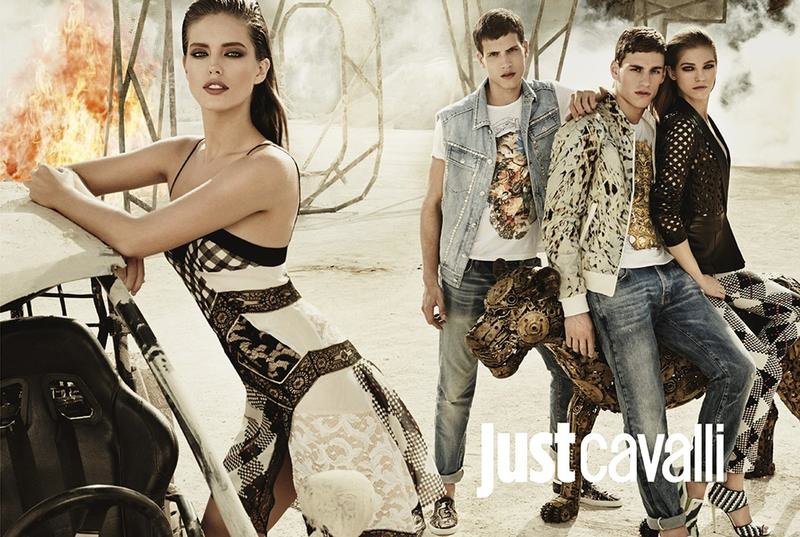
Take Just Cavalli’s Spring/Summer 2014 advertising campaign (http://www.thefashionisto.com/just-cavalli-springsummer-2014-ad-campaign-featuring-adrian-cardoso-mariano-ontanon/). The advertisements appear to be set in front of (what looks like to me) a burning Hollywood sign and uses between two and four models. Both the sign and the models’ poses all create lines that draw viewers’ eyes. Models lean slightly into one another to draw eyes towards the center, or one sits while the other stands and both lean one way to create a line the cut diagonally across the ad. This link (https://mystylefest.wordpress.com/category/ad-campaigns/) also shows ad campaigns for Louis Vuitton, Oscar de la Renta, Burberry, and Louboutin, all of which also use the models’ poses to create lines that draw viewers’ eyes to the product.
If this crash course in visual rhetoric and fashion is not satisfying enough, I highly recommend you check out OWL Purdue’s page on visual rhetoric (https://owl.english.purdue.edu/owl/resource/691/01/), this page from Duke University on visual rhetoric and photography (http://twp.duke.edu/uploads/assets/photography.pdf), Sarah Patterson’s post on visual rhetoric in movies (https://blogs.elon.edu/cupid/2014/10/08/visual-rhetoric-at-the-movies/), or—if you can stomach it—I recommend watching America’s Next Top Model for more fashion insights.
 Follow