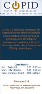
My main goal this semester is to focus on marketing CUPID. The first phase of this plan was to create a rack card, and I wanted to take the time in this post to explain some of the rhetorical decisions I made while designing and putting together the rack card. I started by brainstorming the main information that would need to be included. For example, if this rack card was to be distributed to students in English classes, what would they need to know? The main message to communicate is what CUPID is and what it has to offer. Therefore, the front of my rack card explains what CUPID is, and the back of the rack card provides specific examples of the benefits CUPID offers students. Other than that, I also included the CUPID open hours and location so that students know when they can stop by. In order to be consistent, I kept with the dark blue and gold color scheme and included the CUPID logo. With the basic design, layout, and content established, I brought the draft of the rack card to the CUPID coordinator, Dr. Rebecca Pope-Ruark, and the two other Associates.
It was helpful to have this time to discuss further ideas for the rack card. The other Associates mentioned that I should include not only the web address of the CUPID blog, but also the link to the CUPID homepage. Therefore, I added both of these. I had originally set the background of the back of the rack card to a transparent, repeating image of the CUPID logo. However, Dr. Rebecca Pope-Ruark suggested that instead of uniformly repeating the logo in the background, I scatter the logo. I played around with this design and decided that I liked it better than my original design.
I am happy with the end product, and I am excited to see if the rack card will drive more traffic to CUPID. Hopefully, it will go to printing in the next few days, but does anyone have any other suggestions for information that would be important to include in the rack card?


 Follow