
Will Guy ’16
As you may be aware, all English majors are required to submit a portfolio at the end of their senior year. When making your portfolio, there are many aspects you will want to consider. First, be sure to look at the guidelines before you begin designing your portfolio. This blog post will aim to address the four different pieces of criteria required for portfolios, while also offering some design tips you can incorporate into your own.
If you visit the Professional Writing and Rhetoric page on Elon’s website and click on portfolios, a list of sample senior portfolios is located near the bottom of the page. If you referenced the guidelines, you’ll notice that the first of four required items for inclusion is a Letter to the Reviewer. This is a place for you to build your ethos, talk about relevant coursework, and broadly outline what you will be including in your portfolio. Be sure to include a picture of yourself. Take a look at the two images below.
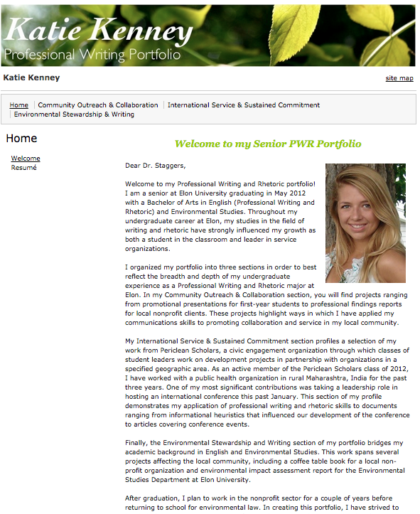
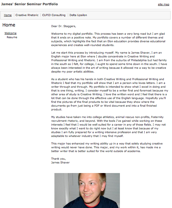
Both screenshots meet the portfolio requirements, but which image at first glance looks more professional? You probably answered the image on the left. This writer used a tool available in most text-based programs known as “wrapping the text.” This allows a user to insert an image without having to worry about altering margins to fit an image onto the page.
The second required section is called the Introduction. This section serves as a place to introduce your work. Give a brief overview, but slightly more specific than the one you included in your Letter the Reviewer. A general tip: you may want to include an image on this page, or any others if you feel that they are relevant.
For the third component, you will include a detailed description of the assignment. Here, you will want to divide the content up into three sections: context, rhetorical strategies, and reflection. If you look at the two figures below, notice the spacing between the subject lines and the text that follows.
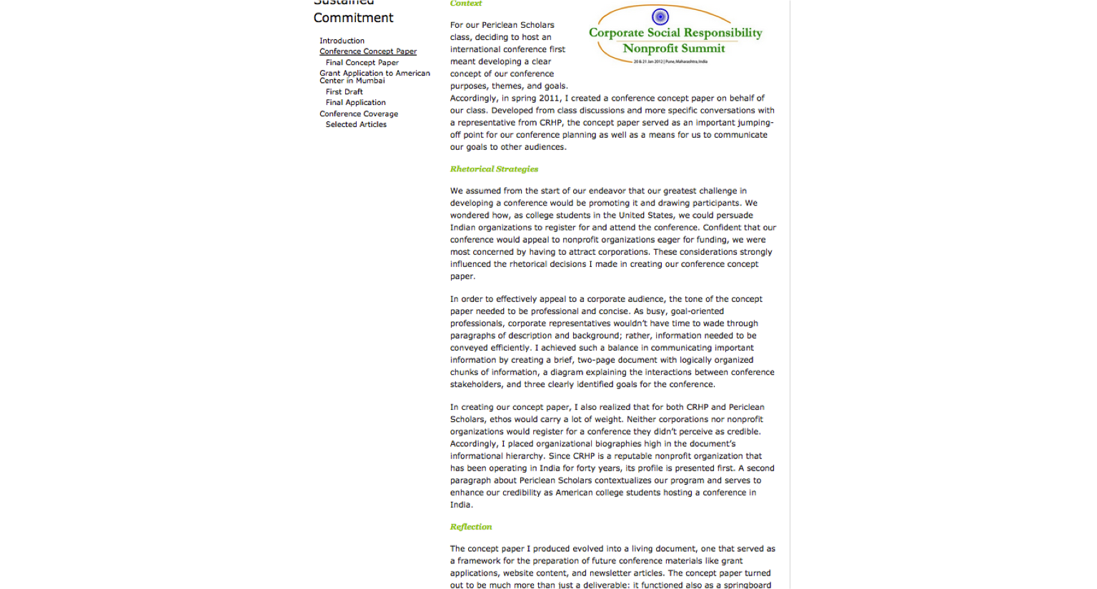
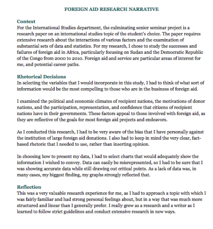
In the image on the left, the spacing between the lines is twice that of its counterpart. Close proximity implies relationship, an aspect you would want to portray in your portfolio.
The last component you need to include is your résumé. This should be on its own separate tab on your webpage. By now, you’ve probably attended many classes devoted entirely to résumé building, and likely have one that you feel comfortable with, but let’s look at a few common practices and do’s and don’t’s.
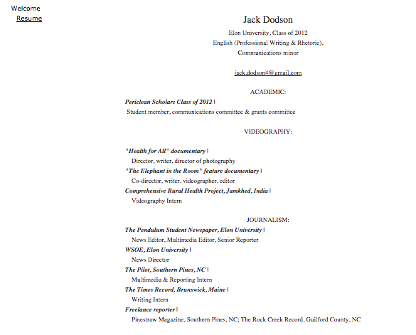
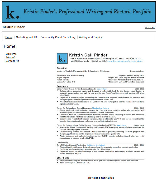
The résumé on the left includes good information, but it lacks significant design. Avoid trapping white space; align items either to the left or right with a corner or side to account for proper alignment. Again, there is too much spacing between line items, making the organization of the résumé appear scattered. The screenshot on the right catches your eye immediately. The large blue and black logo is the first item your eye sees. The use of color helps to create contrast, a design principle that can help you with organization. If you don’t feel that you have the skills to create an affective logo, imagine this résumé without it. Without the logo, the individual’s name is still the largest item on the document, making the document as a whole stand out.
Although your portfolio’s objective is not to land you a job, it could certainly be used to get you one. Once you publish your portfolio, it is on the Internet forever. A résumé is a good place for you to highlight your accomplishments. But if employers are interested in you and want more information and you can send them a link to your portfolio, your chance of getting hired probably just increased. I would strongly recommend updating and maintaining your portfolio well after you graduate Elon.
 Follow