
Alexa Dysch- ENG , PWR ’15
It is interesting how within rhetorical analysis, more than ever, multiculturalism is an important factor to consider. Technology continues to bring the world closer and closer together, alongside a growth in social demand for recognition of individuality/uniqueness. Within the field of rhetoric, one can constantly recognize the need to understand and adapt to such cultural interaction. This is a larger theme that we will consider this week. Specifically, today’s post will discuss cultural differences in color theory and its relation to visual rhetoric.
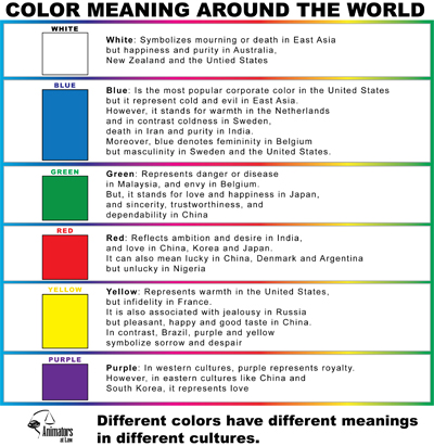
Within the field of visual rhetoric, one is constantly analyzing an audience at hand. Any particular audience can consist of persons with unique backgrounds and cultural identifiers. Certain design principles that apply to an American audience may not apply to one of other cultures. Likewise, color within rhetorical design can differ greatly according to the audience. Consider this infographic and its comparison of colors between cultures. Standards between Eastern and Western cultures are often stark, if not opposing. Colors that have certain connotation from one culture can receive contrasting reviews from another perspective. Most colors, as displayed by the graph to the left, maintain unique representations according to each culture.
This theory is easily represented within cultural standards of dress. The typical bride wears white in the United States, but would be considered ill-dressed and unlucky in China or India. French women are renowned for wearing black, while often such a ‘dark’ color comes with a subsequent association.
Strangely, some colors can maintain dual or multifaceted meanings. Some of those colors include the following:
Blue
- Is calm yet cold.
- Somehow serene or stoic.
Green
- Can start as wealth, but leads to greed.
- Starts with luck, yet continues to jealousy.
Red
- Can easily represent love, yet also loss.
- Resembles energy, but is quickly chaotic.
Yellow
- Cheery to some, but aggravating to others.
- The pinnacle of happiness, yet simultaneously a status for caution.
Furthermore, be sure to consider these cultural differences when designing documents or other visuals. The rhetoric behind visual design is further understood, if not complicated, by this understanding. Your audience, with any capacity for cultural differences, could be influenced by a measure of color consideration.
 Follow
One Comment
So many times I take color choices for granted as being relatively simple. I consider the context enough to match an organization’s branding or the “feel” of an event. Yet, I don’t always think about WHY I am doing this. I like the ties to culture and the depth to which this makes a difference. “Certain design principles that apply to an American audience may not apply to one of other cultures.” This point especially stuck out to me, as some cultures have religious or cultural ties to certain colors. Some countries would never use black as a primary color for anything other than an event surrounding death, while others (like Alexa mentioned is the case with Paris) use black as a chic color. It’s definitely interesting and important to take these concepts into consideration.